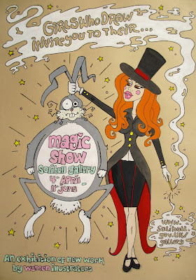
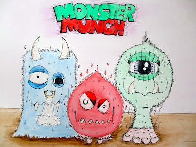
As an illustrator it is important to have a style that is recognisable as your own. However, many illustrators can adapt their signature style, depending on the work needed. Although my portrait work is very linear and 'clean', I also have a very different style, which is alot more colourful and character based. Here are a few examples...
 |
| Poster for 'Girls who draw' exhibition |
 |
| Lady Gaga 'Judas' poster |
 |
| Monster Munch re-branding ideas |
 |
| Mac |
 |
| Editorial work |
